
How To Use Our Ten-Year Capital Market Assumptions
Many are asking "What's next in 2024 and beyond for the markets?” Our Ten-Year Capital Market Assumptions are designed to give clients a look under the hood as to what’s driving our Private Wealth team’s investment decisions. As we know, it’s easy to get caught up in the day-to-day market movements, so we hope long-term investors can turn to these Ten-Year Capital Market Assumptions to help them steady their investment strategies and focus on the longer-term investment objective.
Let’s get right into the report, as compiled by Matt Rice, CFA, CAIA, First Business Bank’s Chief Investment Officer.
- 2024-2033 Capital Market Forecasts Summary
- Inflation Forecast
- Cash Forecast
- Treasury Inflation-Protected Securities (TIPS)
- U.S. Investment Grade Intermediate Bonds
- Short-Term Investment Grade Bonds
- High-Yield Bonds
- Bank Loans Forecast
- Large Cap U.S. Equity Trends
- Large Cap U.S. Equity: Model vs Prediction
- U.S. Equity All, Large, Mid, & Small Cap
- U.S. Equity, International & EM Equity
- Global, U.S. Equity, International & EM Equity
- Real Estate Investment Trusts (REITs)
- Commodity Futures
- Liquid Alternatives Portfolio
2024-2033 Capital Market Forecasts Summary
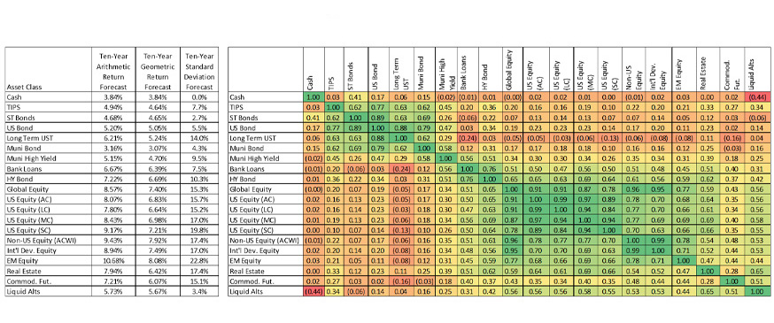
Before we break things down by asset class, here is a useful summary of all of them. You can see “Cash” in the upper left all the way down to “Alternative Investments” from a ten- year perspective, our expected arithmetic return, our expected geometric return, and our expected standard deviation.
On the right side, the orange, yellow and green, these show correlation coefficients. The green areas represent asset classes that tend to move with each other over time. So, you can see that there's a darker green for large cap U.S. equity, all cap, and U.S. equity large cap. Then, you can see other asset classes in more of a red or an orange that tend to have negative correlation to one another.
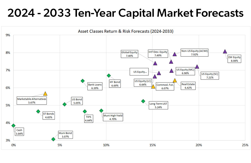
This chart illustrates the same data, but on a graph with return on the vertical and volatility on the horizontal. You can see the green asset classes here represent our ten-year forecast for fixed income categories, the purple represents the equity categories, and the orange represents some alternative investment categories.
Inflation Forecast
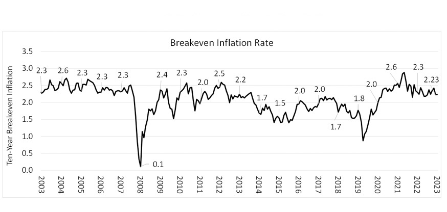
Let’s dive into the building blocks method we're using at First Business Bank. Inflation is not an asset class, but it is an important part of the inputs, or building blocks, to our Ten-Year Capital Market Assumptions process. This chart represents the Breakeven Rate between the ten-year Treasury Inflation Protected Security (TIPS) and the ten-year nominal. So, you have a ten-year Treasury that might have a certain yield associated with it and then you'll have a Treasury inflation protected security, which promises to pay you a certain rate of return plus inflation.
The difference in those yields should be the implied market expectation for inflation, and that's generally our inflation forecast. There are certain periods where we may deviate from that, like the 2008 GFC period or the early 2020 pandemic period when there were flights to liquidity that likely caused a disturbance in the normal TIPS vs. Nominal Treasury spread relationship relationship. But, looking forward for the next ten years, we expect inflation to be 2.23, which is consistent with the difference between the ten-year Nominal of 4.37 and the ten-year TIPS of 2.14.
Cash Assumptions
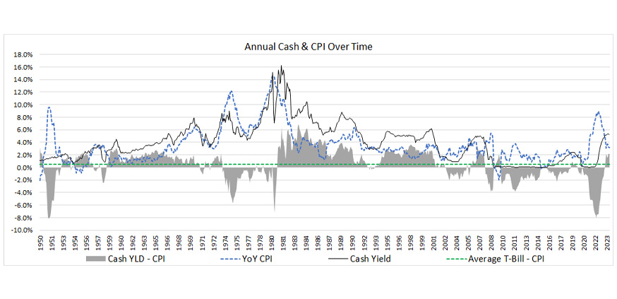
Here is our ten-year cash forecast, but cash is easier to forecast for three months at a time because it comes out every three months. The three-month T-Bill as of the end of November was at 5.45 — a decent forecast for the next three months, but perhaps not for the next ten years. Generally, this graph is a relationship between the cash yield over time and inflation over time. One average over time, the average T-Bill minus inflation has been slightly positive going back to 1950, but you can see that through most of the last 20 to 25 years, it has occupied a slightly negative space.
In this ten-year forecast, we’re assuming that cash will return to a negative real return, meaning it’ll start out at 5.45, a positive real return expectation, but over time, it'll trend down to 2.23, which is our expectation about inflation over the ten-year period. When you average those two together, you get a 3.84% return assumption for cash over the next ten years.
Treasury Inflation-Protected Securities (TIPS)
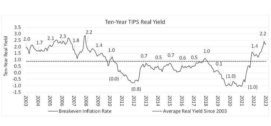
In our opinion, TIPS are a truer risk-free asset. For instance, a nominal Treasury issued with a 4% yield still carries the risk that inflation ends up higher than 4% and you’ll end up losing money on an inflation adjusted perspective. TIPS, on the other hand, are issued with a real yield and then the return will be higher if inflation is higher. It will be lower if inflation is lower. It's a great proxy for how the market is viewing real interest rates and inflation over time.
The ten-year real yield over time has been close to just under 1% positive over the last 20 years or so. During the pandemic phase, you can see that this real yield turned significantly negative. So, if you owned a Treasury inflation-protected security, it might pay you inflation -1% during the 2020-2021 period. Now, with real interest rates rising, we are expecting really a Treasury inflation- protected securities index or Treasury inflation-protected securities to pay us 2.2% plus the expected inflation rate.
When you add this together, 2.23 plus 2.36, the TIPS returns as you can see in the sixth bullet point, that gets us to a 4.64% return for the next ten years.
U.S. Investment Grade Intermediate Bonds
These charts show U.S. investment grade intermediate bonds — we call it Bloomberg U.S. Aggregate Index. This asset class has been surprisingly easy to forecast over the last several years. Take a look at the yield-to-worst, as we call it, which factors in bond optionality. Essentially the current yield of a bond index is a good predictor of the next ten-year return.
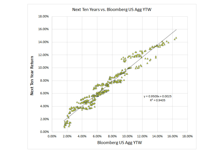
Looking at the regression in the bottom left-hand side, you see all these little yellow triangles and then you see this dotted line connecting them, that dotted line is really the best fit regression line. So we look at that, that dotted line represents really close to a 94% explanation, which means the current yield explains about 94% of the return for the next ten years when you look at things historically, going back to the late 1970s.
Here is a combination of the ten-year return, which is the dark line, and the yield-to-worst. The gray bars represent the air term in this forecast, and you can see it’s small. The current yield-to-worst of the Bloomberg U.S. aggregate bond index is about 5.05%. That's our best unbiased view of what we think U.S. investment grade intermediate bonds will deliver over the next decade.
Short-Term Investment Grade Bonds
Short-term fixed income combines our cash forecast with our investment grade intermediate bond forecast to the tune of about ⅔ bonds and ⅓ cash. That's a good blend for about a two-year duration mix and gets us to about a 4.65% return.
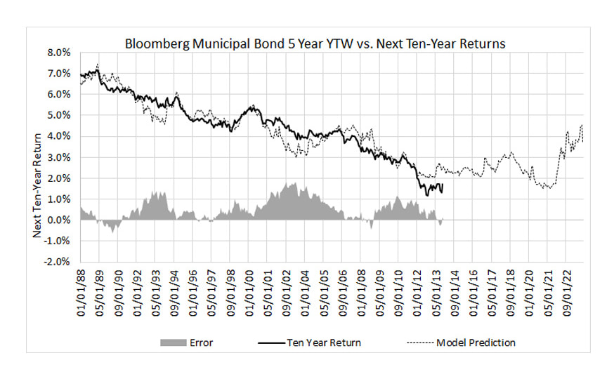
Then we have municipal bonds, which are likely similar to what we saw for the U.S. investment grade bonds. The explanation of this bet fit line is about 89%, so not quite as high, but still high. In this case, we're showing a tax-boosted return. What do we mean by a tax-boosted forecast? Well, our municipal bond forecast might be 3%, but in municipal bonds, you don't pay federal income taxes. So, if you're in the highest income tax bracket of 37%, you can take 3% divided by one minus that tax bracket and that gets you the tax-boosted return. If you earn 4.8% and had to pay taxes, it's essentially the equivalent of earning 3% and not having to pay taxes at a 37% marginal rate.
Then we have high-yield municipal bonds. With anything that's high yield or below investment grade, there's that higher probability of default or that you're not going to get repaid. In this case, we have a regression analysis or regression here that shows about a 77% explanation, so not quite as high as some of the others, but when yields get higher, there's expected to be a higher probability that you will not get paid back even though defaults have been relatively low in municipal bonds at least historically.
Factoring in this model here, this leads us to a current yield-to-worst of about 5.8 leads us to a 4.7% return going forward. And of course, when we tax boost that, we get a very nice 7.46% return that's effectively boosting it to kind of equivalent. So if we earned a 7.46 and had to pay taxes on it at 37%, that would be an implied 4.7% return.
High-Yield Bonds
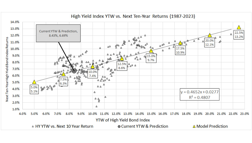
The yield-to-worst in this index was 8.4% as of the end of November. With that, we can look at the same type of regression analysis here. We're getting an R-squared of 0.48, which means this model explains about 48% of returns. A little bit more uncertainty here in the forecast for high yield than some of the other fixed income categories, as you might expect. So implied in this model is a bond default drag or a loss of 1.7%. While the current yield might be 8.4, embedded in here is the assumption that our return is going to be about 1.7%, factoring in a loss over time. Assume for a minute that recovery rate, if there is a bankruptcy or default, is 50% and we have a 1.75% drag associated with it, that's about a 3.5% default rate. With a 3.5% default rate and a 50% recovery rate, that's one way you can get to 1.75% drag.
Embedded in this is assumption is that when credit spreads get higher, you have a higher expected return going forward, but you also have a higher probability of a larger drag rate hitting your portfolio.
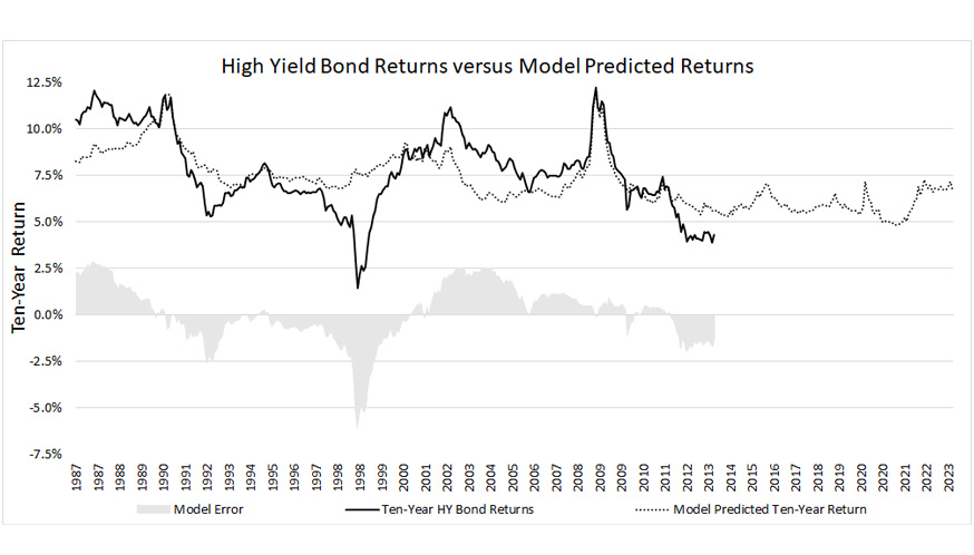
Here’s a chart showing the model vs. the prediction over time with certain areas when the model was spot on, others where there was a little bit more air associated with it, but overall, we think this is the best unbiased forecast for high-yield bonds.
Bank Loan Forecast
Bank loans are a bit unique. We expect bank loans to go up and down with money market yields and short-term interest rates over time and we also expect some losses in bank loans, as not all bank loans get paid back. We're using a lot of the same high-yield bond assumptions here of a 1.74% bond loss. We're factoring in a bit of the same mean reversion we used for cash. All in all, we go from a 9.79% yield-to-maturity as of the end of November to a forecast of about 6.4% or 6.39% over the next decade.
Large Cap U.S. Equity Trends
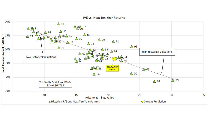
One of the best predictors of the stock market return going forward is simply where are we at from a valuation today?
On the horizontal axis, this model shows the price-to-earnings ratio, and the vertical axis shows the subsequent ten-year annualized rate of return. This tells you when you have been in the upper left with low historical valuations or low valuations by historical standards, your returns tend to be higher over the next ten-year periods. Conversely, when you get to high historical valuations, like 1999, typically those come off excellent ten-year periods and the next decade are destined to not be so great from a forward looking return perspective. The yellow circle is November 30, 2023, where we were from a price-to-earnings ratio perspective; we were at 20.98.
From a valuation perspective, using that regression best fit line, gets us to a forecast of 6.64. We're on the more expensive side of average from where we've been on a historical basis, but we're nowhere near where we were in the tech run-up periods of the late 1990s or other periods with extremely high valuations.
A few other points are interesting to look at. This would have been the prediction of this model in terms of a ten-year forward looking return. If we went back to the end of 2020, you might remember that we were in the midst of the pandemic, the stock market was driven upwards due to unprecedented fiscal and monetary stimulus. Valuations got very high, and baked into that would've been an assumption of a 2.5% return for the next decade.
Of course, since then we had a significant bear market wipe out some of that overvaluation in 2022, you can look at where we're at now, closer to that 6.6% going forward. Had we done this at the end of 2022, we'd have been closer to 9.6% on a forecast. This significant runup we've had in US equity markets in 2023 took us from a 9.6 forward-looking return to a 6.6. We do expect there to be a good deal of variation year over year here with this forecast methodology.
Large Cap U.S. Equity: Model vs Prediction
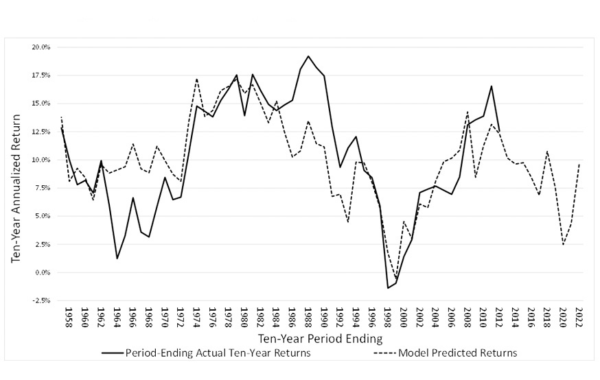
The dotted line is the model's predicted return. The thick line is the period, the actual ten-year return, and this goes back to 1958. As you can see, and there's a strong relationship between the prediction and actual returns.
U.S. Equity All, Large, Mid, & Small Cap
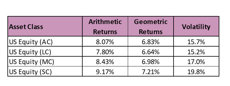
Here we used a Black-Litterman methodology that reverses the portfolio optimization process. So, instead of starting with our expected returns, volatilities and correlations for assets then optimizing them into the ideal portfolio weights, we start with the market weights and work backwards to the implied return inputs. In this case, the market is about 70% large cap, 20% mid cap, and 10% small cap. If we assume that that these large, mid and small cap weights represent a Mean-Variant Efficient Mix as Modern Portfolio Theory suggests, then we can solve for the implied returns that are embedded in market expectations.
We have a large cap expected return of 6.64. The mid cap expectation is 6.98; because it has higher volatility, to be fairly valued, it would have to have a higher rate of return expectation, or nobody would invest in it. Same with small cap. For investors to invest in it, it would have to have an expected return of 7.2 because if it didn't, it wouldn't be worth 10% of the market, which it is.
U.S. Equity, International & EM Equity
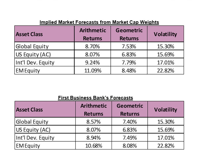
With the same Black-Litterman approach, once we have a U.S. equity, we can look at international and emerging market equities and determine what's implied. Looking at the market, the global equity market is looked at by the MSCI ACWI is about 63% U.S, about 27% international developed, and just under 11% on the emerging market side. That, theoretically, should represent in a theoretical modern portfolio theory sense, the mean variant efficient portfolio, which means that's the portfolio you invest with that eliminates all non-diversifiable risks. If we can plug in the US equity return is, we can tell the computer to solve for the implied international and emerging market return forecasts, given the overall market weights to each component. If you look at that, the US equity all cap gives a 6.8% return. International has a higher volatility, so we need a higher return of 7.79. Same with emerging markets, it's higher volatility needs an 8.48% forecasted return or presumably nobody would invest in it.
We do think there is a better opportunity from an overall pure return perspective outside the US than inside the US given kind of where valuations are at. We've gone through a long period where US equity has dominated and we think there's often a mean reversion that occurs. Given where valuations are today, we see the potential for international and emerging markets to outperform over the next decade. However, we don't think the outperformance is going to be quite as meaningful as what the implied market caps weight.
There's a lot of uncertainty in the world with the war in Europe and uncertainty in Asia going forward, so we trim back some of those returns as a result. Our international is a little underweight — by about 5% both international and emerging. The implied returns for that are 30 basis points lower on the international, so 7.49 instead of 7.79 and about 40 basis points or 0.4% lower on the market of 8.08 than 8.48. Embedded in here are expectations international and emerging are going to have higher returns than the U.S. over the next ten years, but we don't think the magnitude is quite enough to justify the added volatility there. That's why we have these strategic underweights within the international space, modest strategic underweights, but underweights nonetheless.
Global, U.S. Equity, International & EM Equity
This chart illustrates all the equity categories together.
Real Estate Investment Trusts (REITs)
Real estate tends to be dividend return plus the expected increase in rents over time, and we expect rents to increase to the tune of inflation. So, we can combine the current real estate dividend yield to 4.2% plus our inflation forecast of 2.2, and that gets us a 6.4% return.
Commodity Futures
Commodity futures are essentially forward contracts on commodities that are rolled over periodically. In this case, we’re looking at the Bloomberg Commodity Index. With this, cash is a component of the return because, looking at commodity futures contracts in an index, the assumption is that you have cash to collateralize these forward contracts. That cash can earn a 3.8% return. Then, we expect over time commodity spot prices to increase with inflation.
To be conservative, we’re going to a assume a zero-roll return and that brings us to 6.07% commodity return forecast.
Again, commodities are in portfolios because unlike virtually all other traditional financial asset class, commodities like unexpected inflation. When there's unexpected inflation, commodities tend to do well and traditional stocks and bonds don't do so well. So, while commodities might not have a high overall expected return and they might have high volatility, the reason that they're often owned in portfolios is that they zig when everything else zags. And that's certainly has been the case for the 2022 period when we saw significant negative returns out of stocks and bonds when inflation was on the rise, we saw commodities outperformed during that period.
Liquid Alternatives Portfolio
This is customized to some of the liquid alternatives portfolios that we built. Just looking at the volatility budget that we're targeting for these of a 3.4%. If we invested in a portfolio of cash and equities, what blend would get us to a similar volatility? In this case, it would be close to 78% cash in about 22% large cap U.S. equities, which gets us to that same 3.4%. That portfolio would give us about a 4.67% return.
When we're investing in our liquid alternatives portfolios, we expect them to add some value from a risk-adjusted perspective. So that's why we add a 1% expectation for expected excess return over and above that 78% and 22% portfolio.
Thank you for reading our Ten-Year Capital Market Assumptions presentation. We looking forward to reaching out to you to talk about this report and how we're incorporating these assumptions from an investment portfolio construction and a financial planning perspective.
*Financial Planning, Investment Management, Trust & Estate Administration, Company Retirement Plans, Investment Portfolio Services, and Asset Liability Management solutions are NOT FDIC INSURED, NOT BANK GUARANTEED, and MAY LOSE VALUE. First Business Bank is not a tax advisor and recommends you consult your tax advisor before making tax-related investment decisions.
Published: 2/22/2024